GONE NOT LOST
case study no. 1

Project Overview
About: Gone Not Lost is a platform that unites beauty lovers in search of discontinued products. It helps users find their beloved items, discover alternatives, and connect with a community of like-minded individuals passionate about beauty.
Project Type: UX / UI
Duration: 4 weeks
Role: UX / UI Designer
Tools: Figma, Adobe, Canva
RESEARCH & ANALYTICS
IN THIS SECTION:
Problem Statement
User Persona
Research Plan & Interviews
Competitive Analysis
Problem Statement
People who use beauty products are passionate about the brands and products those brands produce. When a product is discontinued these people will go to great lengths to replace those products. Many times those products are near impossible to find leaving these people frustrated and dissatisfied.
User Persona
My user persona was developed directly from insights gathered during user interviews. It played a crucial role in creating a prototype that truly reflected the needs and preferences of a “real-life” user of my product. Throughout the design process, I continually cross-referenced my persona to ensure I was building a website that would genuinely serve individuals looking for their favorite discontinued beauty products.
User Motivations
Viable reviews and testimonials
Popular products
Fair prices
User Needs
Find a discontinued product that she loves
Get reassurance in her decision by seeing what other people are saying about the product of interest


One on One Interviews
I conducted a series of one-on-one interviews with a diverse range of individuals, each bringing their own unique background and personal experiences. My goal was to gather a variety of perspectives to shape the most effective course of action for Gone Not Lost. By tapping into these different viewpoints, I aimed to ensure the approach was a well-rounded and impactful as possible.
Competitive Analysis
Our competitive analysis uncovered valuable opportunities to improve our platform by learning from similar companies. While Amazon and eBay dominate the industry, they struggle with maintaining consistent customer satisfaction and fail to fully address the niche we aim to serve. In contrast, By Me Beauty, a smaller yet aligned competitor, excels in customer service, boasts glowing reviews, and has a strong community focus qualities that closely mirror our own vision.
Person 1.
Research Plan & Interview
The first step of user interviews in developing a research plan. My research plan was composed of these 6 main components:
1.Project Background / Problem
2.Research Goals
3.Research Objectives
4.Assumptions / Risks
5.Timeline
Person 2.
Person 3.
Person 4.

WIREFRAMES & PROTOTYPES
IN THIS SECTION:
Wireframe Evolution
Mood Board
Style Guide
High Fidelity Wireframes
Lo-fi Wireframes
I began my lo-fi wireframes with pencil and paper to ensure I had all of the necessary components and a clear vision before transitioning to the digital version.

Mid-fi Wireframe


Style Guide
Hi-fi Wireframes


These sketches evolved into lo-fi digital wireframes, which helped me refine my direction and gain more clarity before moving on to mid-and high-fidelity wireframes.

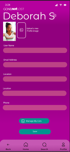
This mid-fi wireframes built upon the lo-fi version, allowing me to experiment with the profile page’s content and explore the overall aesthetic of the website.


Mood Board & Inspiration
Aligned with our mood board, inspirations, and Crystal’s vision, we developed a style guide that is sleek, straightforward, and effortless to navigate.
Our client, Crystal, shared her vision for the website’s design. In addition to steering clear of the “doom scroll”, she emphasized the importance of a clean aesthetic complemented by bright, warm colors to evoke a sense of inviting warmth. She envisioned a look that is both beautiful and classy. In response, we conducted a search for a color palette and overall mood that aligns with user expectations while fulfilling our client’s desires.